I'm a graphic designer. I make things, lots of things. Posters, books, t-shirts, window signage, product packaging and even a temporary tattoo for kids. However it's not very often that I get to combine design with my other love: food. (Don't tell design but in a thumb war, I'm pretty sure food would win). So when Melissa approached me about creating a logo / mark for the Little Locavores blog, the answer was enthusiastically YES.
When starting a project I like to put myself in the shoes of the client and the audience, or in this case the audience's little ones! As soon as I figuratively slipped on my old strawberry shortcake velcro size 1's (circa 1985) I knew what I would do for the logo: draw with my food.
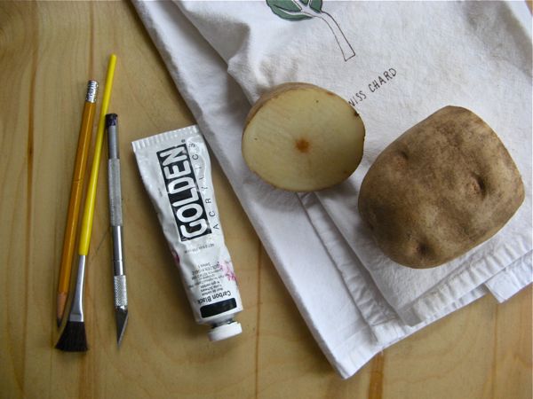
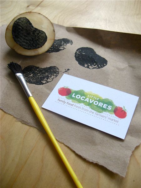
I went with the classic "potato as stamp" route. After a couple of disastrous potato incidences (accidentally turning my star into one lonely triangle) I got the hang of it again. Soon I had a few apple-y and tomato-y looking creations. They weren't perfect, but that wasn't the goal here. There were surprises along the way, things I hadn't planned on and imperfections that gave each little potato stamp it's own personality : just what I thought would fit well with the content in this blog.
It was a great break from creating on the computer (my daily routine) and an excuse to get an excessive amount of potatoes, resulting in potato pancakes, home fries, and gnocchi later in the week.

-------------------------------------------------
About Julie : In between running the graphic design business (Letterform, Inc.) she owns with her fiance, Andy, and printing her very own line of foodie greeting cards (Nourishing Notes), Julie is consumed by food.... or consuming food.


No comments:
Post a Comment